‘Life of the Party’, Olivia Gatwood
2021
Publication design
Typography
Photography
Typography
Photography
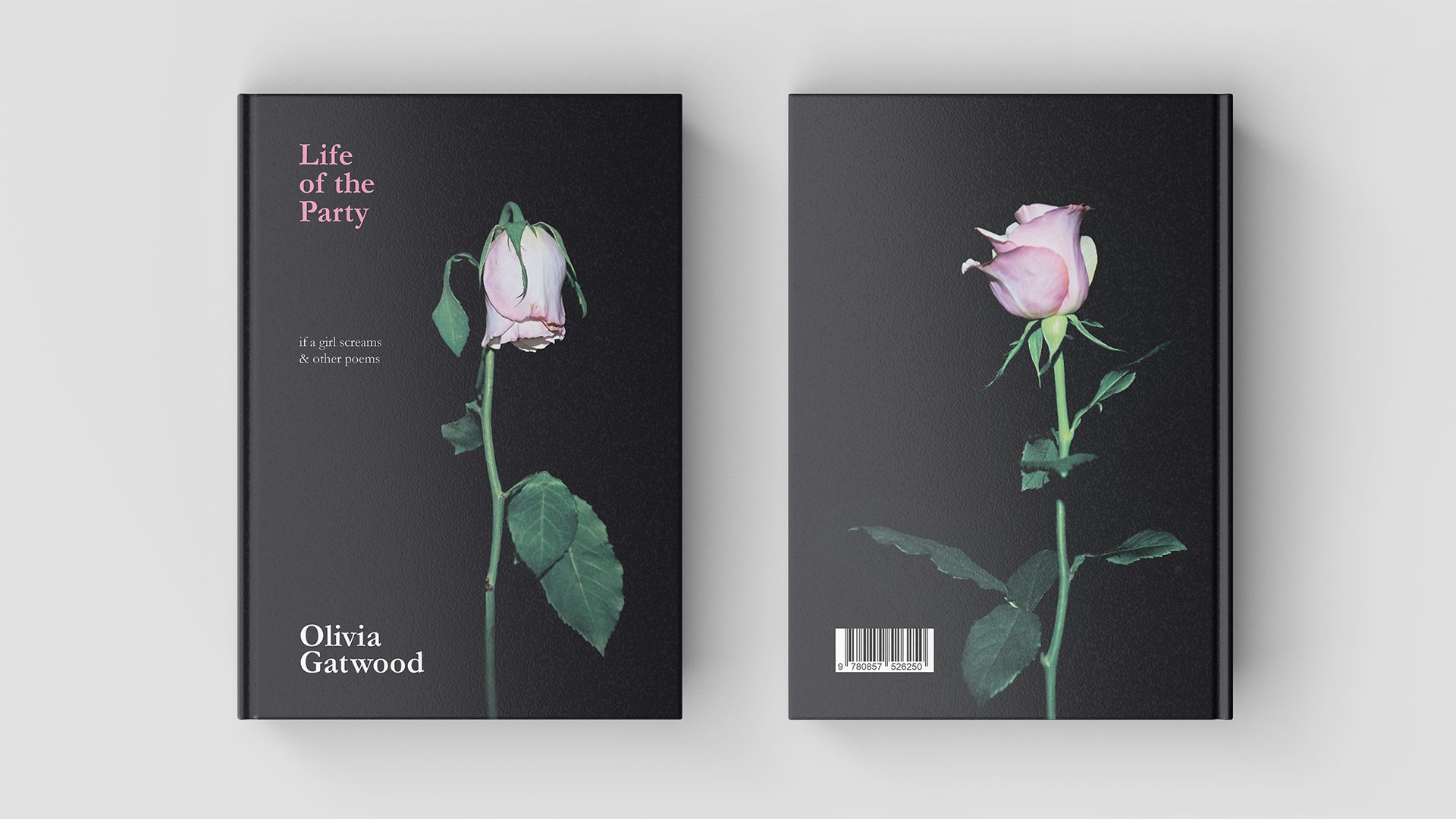
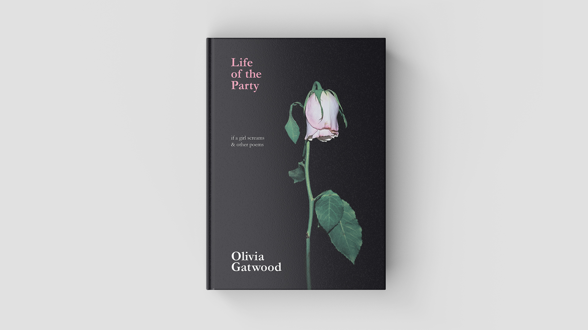
Upon initial glance of the cover, the audience can see the
title and laugh (a little grimly) at the irony of the words ‘Life of the Party’
hovering above a dying rose. Let the rose represent the girl who is, “silent
and dead and still the life of the party”.
Inspired by true crime and her own experiences, Gatwood writes about what it is like to grow up as a woman today; how mass media romanticises violence against women and contrasts how society, media, and the police deal with transgender women and women of colour in comparison to white women.
The cover design utilises pink roses to represent the major themes of ‘Life of the Party’. In art and literature, roses have been used to represent romance, femininity, sexuality, and the female body. They are also associated to the transience of life due to their short lifetime, and mourning.
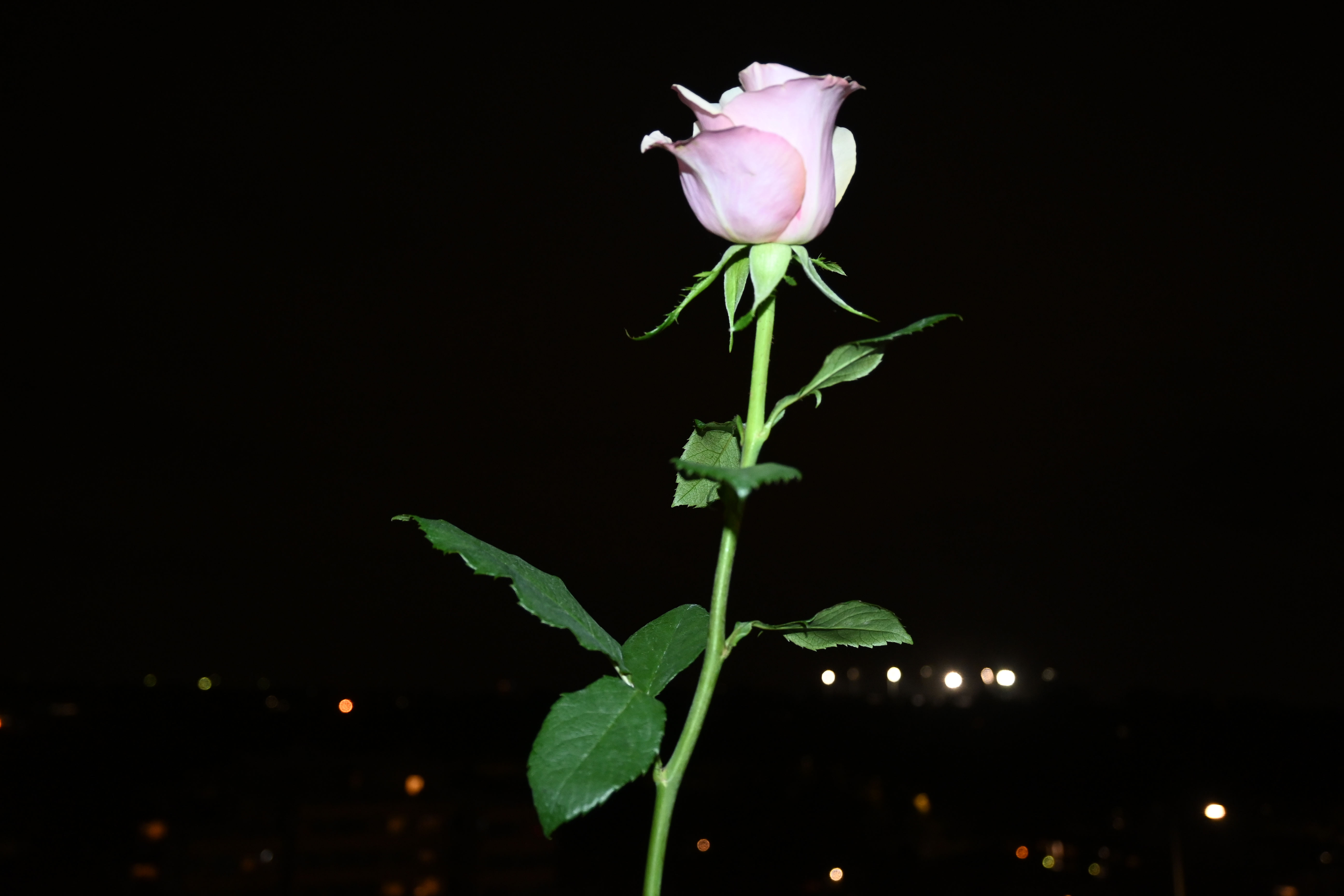
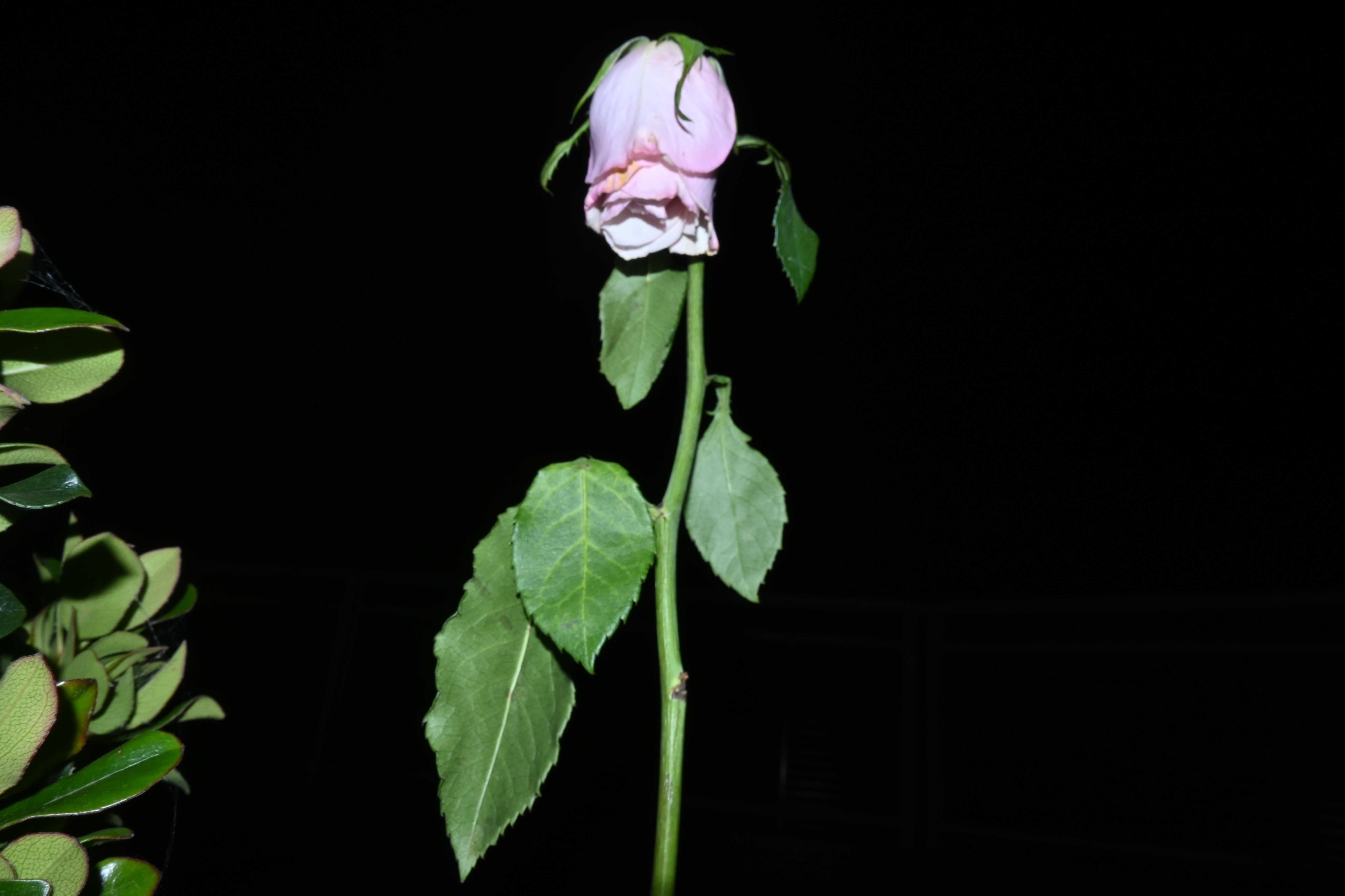
The back cover features a rose in stages of life – blooming and budding – whilst the front cover depicts a rose in stages of death – wilting and decaying. The juxtaposition of these elements represents the themes of the collection: growing up as a woman, the everyday and unspoken violence against women, the romanticisation of violence against women (as perpetuated by mass media), and the mourning of dead girls. The contrast between the stages of life for the rose also serve to reflect how women of colour and transgender women are murdered at an alarming rate, often without police investigation or media coverage compared to the way violence against white women is sensationalised across media – “a perpetrator of misogyny, racism, and sexualised violence.”
Inspired by true crime and her own experiences, Gatwood writes about what it is like to grow up as a woman today; how mass media romanticises violence against women and contrasts how society, media, and the police deal with transgender women and women of colour in comparison to white women.
The cover design utilises pink roses to represent the major themes of ‘Life of the Party’. In art and literature, roses have been used to represent romance, femininity, sexuality, and the female body. They are also associated to the transience of life due to their short lifetime, and mourning.
The back cover features a rose in stages of life – blooming and budding – whilst the front cover depicts a rose in stages of death – wilting and decaying. The juxtaposition of these elements represents the themes of the collection: growing up as a woman, the everyday and unspoken violence against women, the romanticisation of violence against women (as perpetuated by mass media), and the mourning of dead girls. The contrast between the stages of life for the rose also serve to reflect how women of colour and transgender women are murdered at an alarming rate, often without police investigation or media coverage compared to the way violence against white women is sensationalised across media – “a perpetrator of misogyny, racism, and sexualised violence.”
‘Ode to Pink’ (pg. 127): “My favourite colour is Pepto-Bismol”.
To maintain the themes of the collection, I wanted to focus on the contrast between light and shadow however also incorporate an accent colour to stand out against the rest of the design. In ‘Ode to Pink’ (pg. 127), Gatwood writes, “My favourite colour is Pepto-Bismol.” Pink is very often associated with femininity and is frequently used in marketing products towards women. In the design, it carries the audiences attention across the pages of the book, creating a symbiotic harmony.

Graphic Designer based in
Melbourne, Victoria.