'clean hands', Bowen Street Press
DOC 234—34/2
DEUS: 088/26812—81
REX-13: 978-0882681/283
REX-13: 978-0882681/283
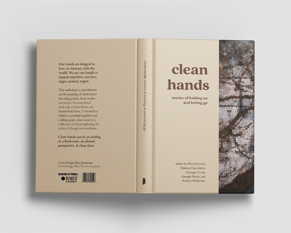
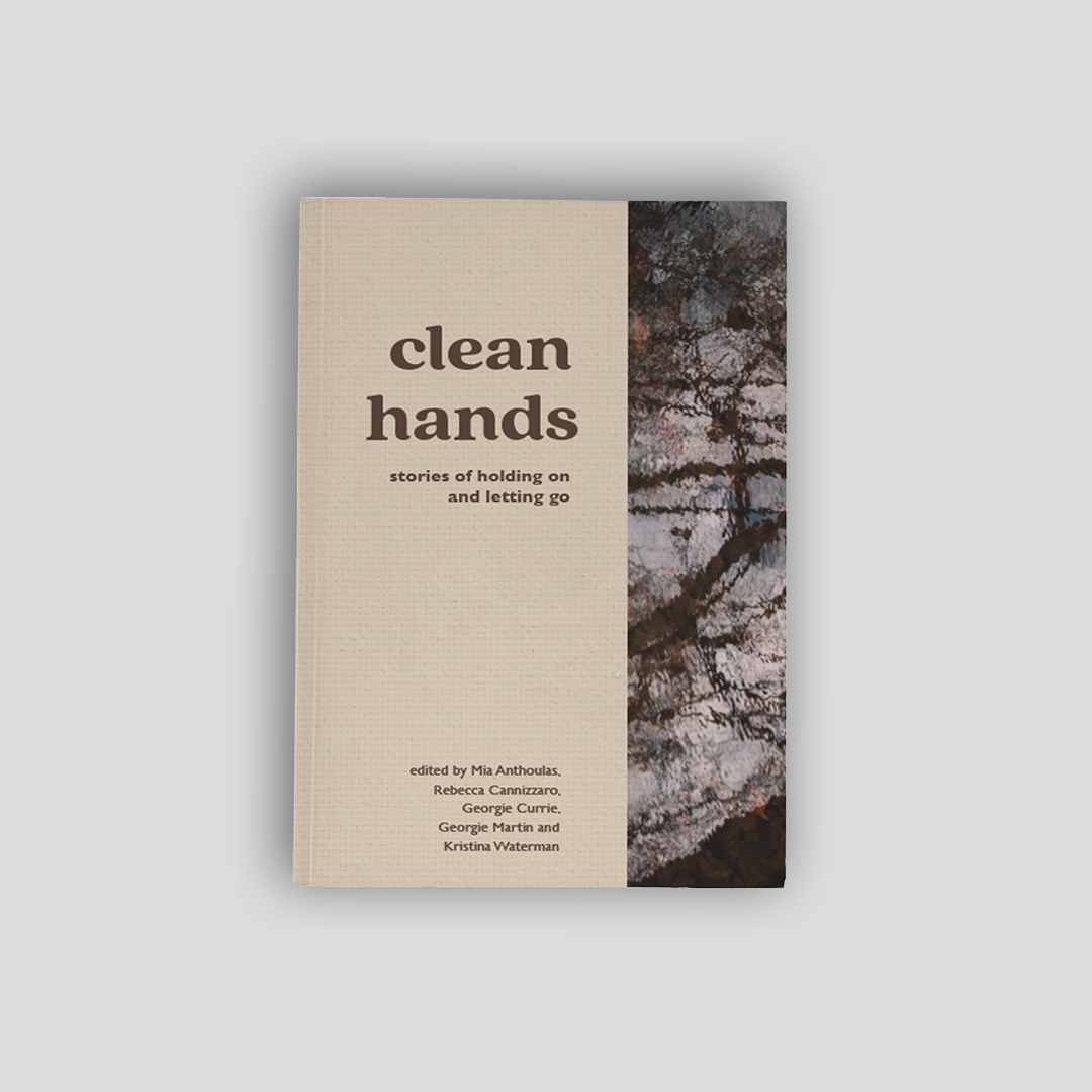
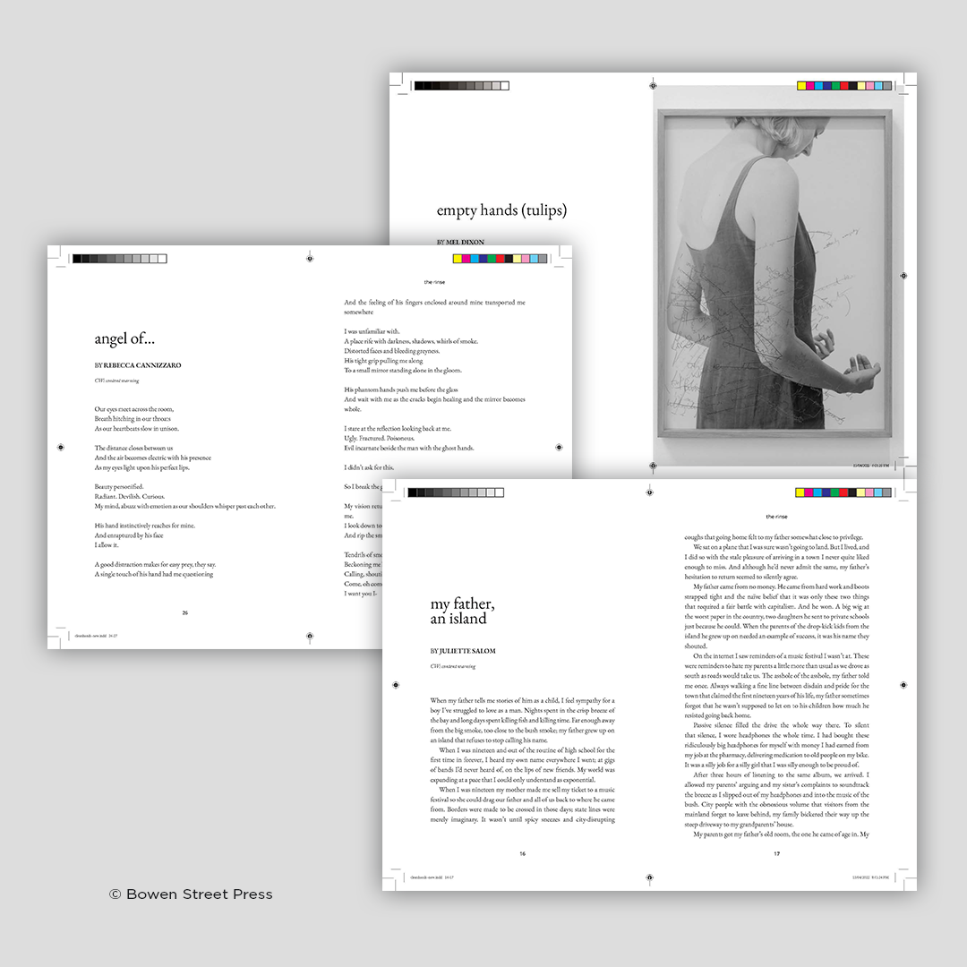
With the design of 'clean hands', we strived to highlight the content of the anthology without overshadowing it. To create cohesion and capture the mood of the book, soft, transitory imagery was used throughout. The collection was created using both sans serif and serif typefaces so as not to age the content with the classical nature of the serifs. When used in conjunction with sans serif, the text appears modern. For the titles, a soft, round typeface was used to connect the ideas of the body and water. The interior design of the book also followed the same ideas of fluidity witnessed throughout the rest of the design. There exists structure but it ebbs and flows with the content of the book.

Graphic Designer based in
Melbourne, Victoria.